Is A Secret Habit Making Your Email List Sign-Ups Costly?
You already have people landing on your sign-up page every week. Some read the whole thing. A few even reach for the email box. Then nothing happens, and you are left guessing why your email list sign-ups refuse to grow.
It is tempting to blame the headline, or the offer itself, and rewrite both for the third time this month. For a lot of beginners building their first list, the real problem is smaller than that, and far easier to miss, because it rarely shows up as a mistake on the page at all.
If you have jumped between affiliate marketing, dropshipping and a dozen other ideas looking for the one that finally sticks, you already know how easy it is to overthink the big decisions. You also know how easy it is to overlook the small ones sitting right under your nose.
This is one of those small ones. It costs almost nothing to fix, and it could be the biggest reason your email list sign-ups are lower than they should be.
The Habit Hiding On Almost Every Sign-Up Page
Open your own sign-up page in a new tab right now. Count every clickable thing on it: buttons, menu items, social icons, a second offer lower down.
Most pages have four or five. Each one felt harmless when you added it. Together, they are quietly working against the one action you need a visitor to take.
Picture a typical page: a main menu across the top, a second offer in the sidebar, three social icons by the headline, and a button linking to another blog post underneath the opt-in. None of those looks like a problem on its own. Together they turn one simple decision into five.
Nick James has written about this exact habit. He points out that every extra link you place next to your main call to action competes with it. Most visitors solve that competition by closing the tab instead of choosing.
It matches something I would expect from years spent getting a job right the first time. The problem is rarely the big thing you can see. It is the small thing nobody thought to remove, the loose screw rather than the broken frame.
Why A Busy Page Feels Different To A Confusing One
A visitor rarely lands on your page by accident. They came looking for one answer to one problem, and they expect your page to give them a single, obvious next step.
Hand them four or five possible next steps instead, and their focus splits. A quiet doubt creeps in: is this page even built for me?
That doubt is enough. Most people will not stay to work it out. They will simply leave, and your email list sign-ups will stay flat without ever telling you why.
Think about the last form you abandoned yourself. The chances are good it was not the headline that put you off. It was the sense that you were not quite sure what would happen next, or whether clicking would lead somewhere you had not agreed to. Visitors to your own page feel exactly the same hesitation, and a page crowded with choices gives that hesitation somewhere to grow.
I have talked before, in other articles I have shared recently, about building things properly rather than patching over the symptom. This is the same idea applied to a sign-up page. Fixing the headline again is patching the symptom. Removing the clutter fixes the actual problem.
A Five-Minute Check For Your Own Page
You do not need new software or a redesign to test this. You need five honest minutes.
Open your page and list every clickable item on it. Then ask one plain question of each: does this help a visitor sign up, or does it give them a reason to leave instead?
Anything that fails that test gets removed, or pushed well below your main button. Keep the headline, one short line of benefit, the email box, and one button that says exactly what happens next.
Say your page currently has a top menu, a social row, a secondary banner and the sign-up box. Removing the menu and the banner, and pushing the social icons into the footer, leaves exactly one choice on the screen: read the headline, then sign up. That is the whole point of the exercise.
Give a visitor one clear door and most of them will walk through it.
Add one short sentence underneath the button too, naming exactly what the visitor will get and when. Something plain, like telling them the guide arrives by email within minutes and nothing else follows it. That one line answers a worry most visitors never say out loud, and it matters more than another clever headline.
Match The Fix To Where You Actually Are
If you are still choosing between strategies, this fix works whichever one you land on. A cluttered page loses subscribers whether you are promoting affiliate offers, a free guide, or your own early product ideas.
If you are promoting someone else’s offer, the extra links often are not even yours. A theme’s default social icons, a stray link back to your homepage, a comment box with its own button. Clearing those takes minutes and costs nothing, yet it can lift the number of people who finish the one action you want from the page.
If you are already deep into building your list, this is often the fastest improvement available to you. You are not writing a single new word. You are simply getting out of your own way.
Think of two versions of the same visitor. One lands on a page with five competing links and leaves unsure what to do. The other lands on a page with one clear door and a single plain promise underneath it. Same traffic, same offer, different result, simply because one page asked less of their attention.
I suppose you could say the traffic was never the problem. It was arriving at a door with five handles on it and no clear way through.
Why This Matters More Than Another Headline Tweak
You can write a strong offer and still lose most of your visitors to a page that asks too much of their attention. This is not a writing problem. It is a focus problem.
Imagine spending another week rewriting your headline for the fourth time, only to watch the same number of visitors leave without signing up. The words were never the issue. The five competing links were doing the damage the whole time, quietly, underneath whichever headline you tried.
Fix the focus first, and the words you already have will very likely start working harder, because they are finally the only thing competing for the click instead of sharing the page with four or five distractions.
Once your own page is doing its job properly, the next question becomes how you turn those extra email list sign-ups into an actual relationship with the people who join. That is where a structured approach to email marketing earns its place, rather than sending the odd message whenever you remember to.
If you want to go further than this one fix, Lazy Way To Email Riches is worth a look. It is built around growing and using an email list without needing to be a copywriter or spend a fortune on traffic. That makes it a reasonable next step once your sign-up page is finally pulling its weight.
Pick one small habit this week rather than trying to fix everything at once. Clear the clutter from one page, give your visitor one door, and watch what happens to your numbers.
Best wishes, Dean
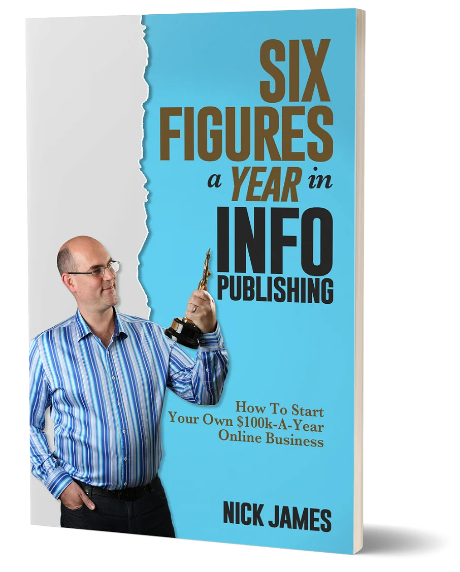
Author offers a FREE copy of this book to his next door neighbor... to prove he's not a drug dealer!
Now claim your FREE COPY.
and follow the step-by-step instructions for making the kind of money (and living the kind of lifestyle) that'll get your neighbors curtains twitching with curiosity!
Enter your details below to discover how to claim your FREE COPY of 'Six Figures A Year In Info Publishing' ...
Privacy Policy : We value your privacy. You can unsubscribe from receiving future emails with 1 click at any time.