Why Aren’t Visitors Signing Up To My Email List?
You’re getting visitors to your email sign-up page, but hardly anyone is subscribing. Some people read the page, others scroll down to the form, yet most leave without entering their email address.
It’s frustrating, particularly when you’ve spent time creating a useful free offer and attracting visitors in the first place. The natural reaction is to rewrite your headline, change your offer or look for more traffic. But sometimes the problem is much simpler.
In Short: If visitors aren’t signing up to your email list, one possible reason is that your landing page gives them too many competing choices. Navigation menus, social media links, secondary offers and unnecessary buttons can distract visitors from subscribing. Simplifying the page and making the next step obvious is a useful improvement to test.
The Hidden Problem With Busy Sign-Up Pages
Open your email sign-up page and count how many clickable elements appear on it. You might find a navigation menu across the top, several social media icons, links to other articles, a promotional banner and perhaps a second offer further down the page.
Each element probably seemed harmless when you added it. After all, giving visitors more options sounds helpful. But when the purpose of a page is to encourage one specific action, those additional options can work against you.
Imagine arriving at a page offering a free guide about starting an online business. You’re interested in the guide, but there’s also a link to another article, a button promoting a different product and several social media icons competing for your attention.
Instead of concentrating on the guide, you now have several decisions to make. Some visitors will still subscribe. Others may become distracted, follow another link or leave without taking any action. The problem isn’t necessarily your offer. It may be that your page isn’t making the next step sufficiently clear.
Why Too Many Choices Can Reduce Email Sign-Ups
A visitor usually arrives on your sign-up page because something has attracted their interest, perhaps they clicked a link in an article, followed a recommendation or responded to an advertisement.
They have a particular expectation about what they’ll find. If the page immediately presents several unrelated choices, that expectation becomes less clear. The more attention you ask visitors to give to competing elements, the less attention remains for your main offer.
This doesn’t mean every link is harmful or that all landing pages should look identical. It means every element should have a purpose. If the main objective is to encourage someone to subscribe, anything that distracts from that objective deserves closer examination.
I learned something similar during my years working with traditional sash windows. Sometimes a problem that looked complicated came down to one small detail that had been overlooked. You could spend hours adjusting everything around it, but until you dealt with that detail, the problem remained.
A sign-up page can be much the same, before rebuilding the entire page, look for the small things that might be getting in the way.
A Simple Five-Minute Sign-Up Page Check
You don’t need expensive software or a complete website redesign to begin improving your email sign-up page. Start by opening it as though you’re a first-time visitor. Don’t look at it as the person who created it. Look at it as someone who knows nothing about your business.
Then work through these five checks.
1. Is the Main Offer Immediately Clear?
Can a visitor understand what they’re being offered within a few seconds?
Your headline should communicate the main benefit, while the supporting text explains what the visitor will receive.
If someone needs to read several paragraphs before understanding the offer, the page may need simplifying.
2. Is There One Obvious Next Step?
Look at the buttons and links on the page.
Does one action clearly stand out, or are several elements competing for attention?
If your objective is to collect email subscribers, the sign-up form should be easy to find and use.
3. Are Unnecessary Links Distracting Visitors?
Navigation menus, social media icons and unrelated promotional links can encourage visitors to leave the page before subscribing.
Consider removing unnecessary links or moving less important elements away from the main offer.
Keep essential information, including appropriate privacy information, accessible. The aim is to reduce distractions, not hide information visitors need.
4. Does the Button Explain What Happens Next?
A button labelled “Submit” doesn’t tell visitors very much.
Something more specific, such as “Send Me The Free Guide”, makes the next step clearer.
The wording should accurately describe what happens when someone clicks.
5. Have You Explained What Happens After Signing Up?
Visitors may hesitate because they aren’t sure what they’re agreeing to.
Will they receive a download? A series of emails? A newsletter?
Explain what they’ll receive and what other emails, if any, they can expect.
For example:
“Enter your email address to receive the free guide. You’ll also receive occasional emails with practical online business tips.”
The wording should reflect your actual email practices. That small explanation can help visitors make a more informed decision.
How Do You Know Whether Your Changes Are Working?
This is where many website owners make another mistake. They change several things at once and then assume the page has improved because it looks better, but appearance alone doesn’t tell you whether more visitors are subscribing.
You need to measure the results. A simple metric is your email sign-up conversion rate.
For example, suppose 200 people visit your sign-up page and 10 subscribe.
Your conversion rate is 5%.
If another 200 visitors arrive after you’ve simplified the page and 16 subscribe, your conversion rate is 8%.
That’s an improvement worth investigating. However, don’t assume the page changes caused the difference automatically. Traffic quality, visitor behaviour and other factors can influence results.
For a more reliable comparison, test the original and revised versions with similar audiences, ideally using an A/B test. The important point is to measure what happens rather than relying on guesswork.
What If Removing Distractions Doesn’t Improve Sign-Ups?
A cluttered page is only one possible reason visitors don’t subscribe, if simplifying the page makes little difference, look at the offer itself. Does your free resource solve a problem your audience actually cares about?
Is the benefit clear enough?
Are you attracting visitors who are interested in the subject?
Does the form work properly on mobile devices?
And are you asking for more information than you genuinely need?
Sometimes the problem isn’t the number of links. It’s that visitors don’t see enough value in exchanging their email address for what you’re offering. That’s why improving conversions should be treated as a process of testing and learning rather than following a single rule.
Why A Clear Sign-Up Page Matters For Your Online Business
Building an email list gives you an opportunity to develop an ongoing relationship with people interested in your subject, but attracting visitors is only the beginning.
If your sign-up page doesn’t clearly explain what you’re offering and how to receive it, some of that traffic may never become subscribers. And continually trying to attract more visitors won’t necessarily solve the underlying problem.
Before investing additional time or money into traffic generation, make sure your existing visitors have a clear opportunity to take the next step.
You may discover that a few small changes make a bigger difference than another complete redesign.
What Happens After Someone Joins Your Email List?
Getting someone to subscribe is only the first step. Once they’re on your list, you need to give them a reason to remain interested.
That means delivering what you promised, sharing useful information and gradually building trust. You don’t need to send complicated marketing campaigns every day. But you do need a sensible approach to communicating with your subscribers.
If you’d like to explore that side of email marketing, Lazy Way To Email Riches is worth a look. It explores how to build and use an email list without needing to become an expert copywriter or spend a fortune attracting traffic.
Final Thoughts
If visitors aren’t signing up to your email list, don’t immediately assume you need a better headline, a completely different offer or more traffic.
Start by examining the page itself, remove unnecessary distractions, make your offer clear, explain what happens after someone subscribes and ensure there’s an obvious next step.
Then measure the results. You might find that the biggest improvement comes not from adding something new, but from removing something that never needed to be there.
Sometimes the simplest way to improve a sign-up page is to give visitors fewer things to think about and one clear reason to act.
Best wishes,
Dean
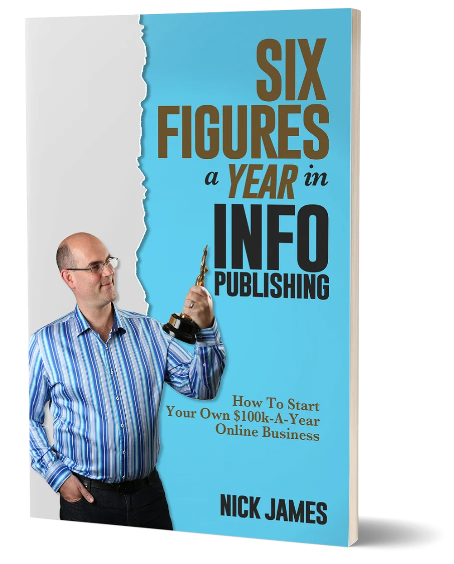
Author offers a FREE copy of this book to his next door neighbor... to prove he's not a drug dealer!
Now claim your FREE COPY.
and follow the step-by-step instructions for making the kind of money (and living the kind of lifestyle) that'll get your neighbors curtains twitching with curiosity!
Enter your details below to discover how to claim your FREE COPY of 'Six Figures A Year In Info Publishing' ...
Privacy Policy : We value your privacy. You can unsubscribe from receiving future emails with 1 click at any time.